












Visualization Models
Discover my visualization journey through the selected projects below.
Portfolio of advanced scientific visualization models developed by Reuben Reyes (HitechMex).
Biological & Anatomical 3D Visualizations
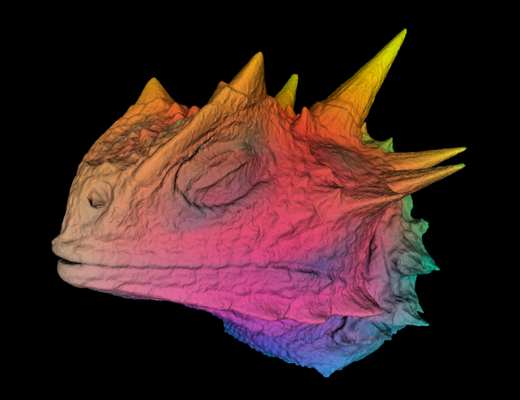
Texas horned lizard with false color using three different color attributes from X-ray Computed Tomography reconstruction and non-invasive anatomical 3D modeling. Research by Dr. Wendy Hodges and Reuben Reyes. 3D model and visualization by Reuben Reyes at The University of Texas ACES Visualization Laboratory. (Year 2003)
Geospatial & Geophysical Data Rendering
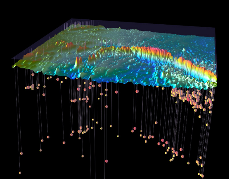
Macquarie Ridge complex bathymetry from side scanning sonar with added earthquake hypocenters vertical lines and spheres. Research by Dr. Tip Meckel and Reuben Reyes at the ACES Visualization Laboratory (also know as TACC’s Vislab). 3D model and visualization by Reuben Reyes. (Year 2004)
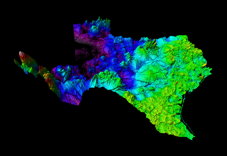
Texas subsurface at 300 degrees Fahrenheit from ~30,000 well logs and spatial interpolation of volumetric subsurface. This study and visualization was for an assessment of the geothermal energy potential from subsurface heat as a function of depth. In the above image you can see a potential geothermal spot (white redish peak) in close proximity to El Paso, Texas. Research at Bureau of Economic Geology, GRIDS Research Group by Bruce Cutright, Harold Rogers, and Reuben Reyes. Isosurface and visualization by Reuben Reyes. (Year 2014)
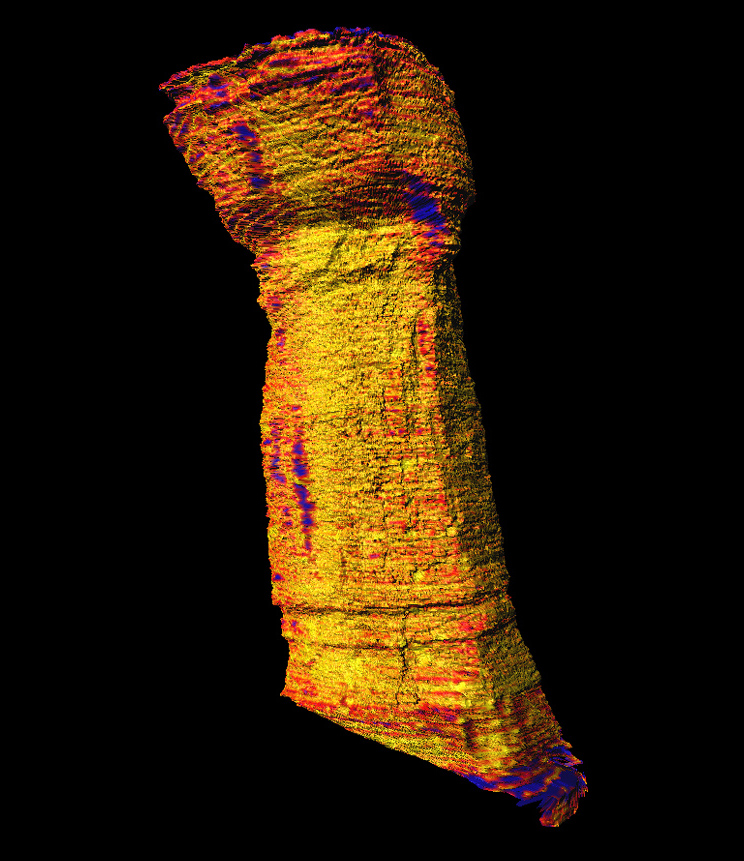
Probability map on surface of Zacaton sinkhole from DepthX sonar point cloud color derived by using point distribution density and point spread despersion. Research by Dr. Marcus O. Gary and Reuben Reyes from The University of Texas at Austin. Visualization by Reuben Reyes. (Year 2009)
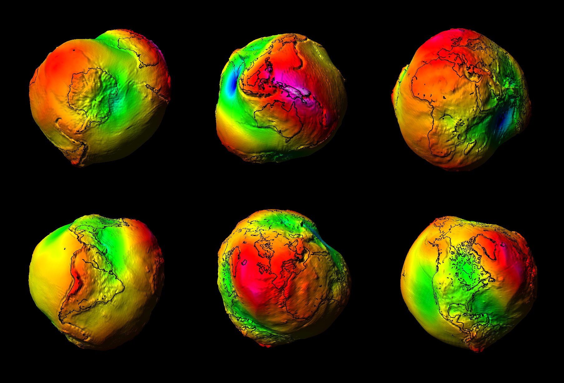
Lumpy Earth from GRACE data gravity field. In the images stronger gravitational signals show up in white and pink (Indonesia) vs weaker gravitational signals show up in blue (Southern India). Research at The University of Texas at Austin Center for Space Research by Dr. Byron D. Tapley. Concept and design of 3D model, and Visualization by Dossym Nurmukhanov and Reuben Reyes at the ACES Visualization Laboratory. (Year 2004)
LiDAR, Photogrammetry & Surface Fusion Projects
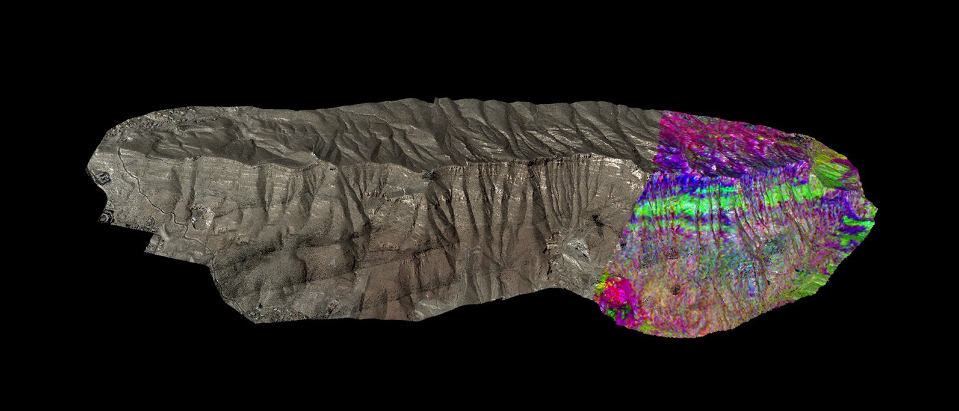
98 million LiDAR points with color (natural and hyperspectral) of the Franklin Mountains. Shading was derived by using a specialized spherical filter of near surrounding points to fit a plane and then assigning a normal to each point individually. Research at Bureau of Economic Geology Reservoir Characterization Research Laboratory by Dr. Jerome Bellian and Reuben Reyes. Point cloud processing, geometry/image fusion and visualization by Reuben Reyes. (Year 2009)
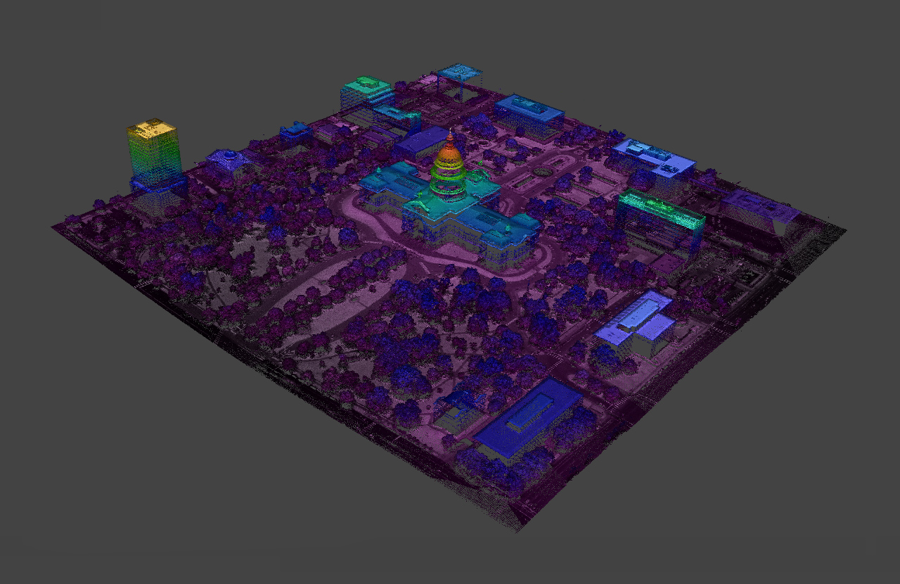
2012 Texas State Capitol Point Cloud aerial LiDAR and geometry fusion. Data collection by Aaron Averett and Dr. Kutalmis Saylam from the Near Surface Observatory at The University of Texas at Austin. LiDAR colorization, geometry fusion, and visualization by Reuben Reyes.(Year 2013)
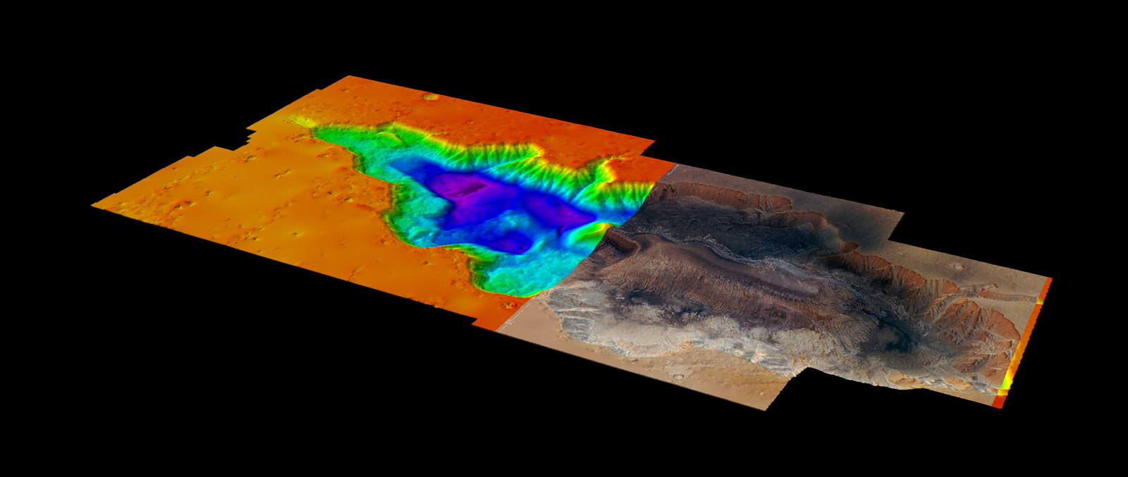
Point cloud of Mars Hebes Chasma with natural color and elevation color ramp scale from NASA's Mars Global Surveyor and image from ESA/DLR/FU Berlin (G. Neukum). Research at Bureau of Economic Geology Applied Geodynamics Laboratory by Dr. Tim Dooley. Point cloud processing, geometry/image fusion and visualization by Reuben Reyes. (Year 2014)
Fluid Dynamics and Meteorological
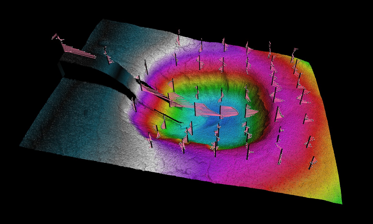
Time-averaged velocity vectors of a turbidity currents. Research conducted at The University of Texas at Austin Morphodynamics laboratory by Dr. Vishal Maharaj and Reuben Reyes. 3D model and visualization by Reuben Reyes. (Year 2012)
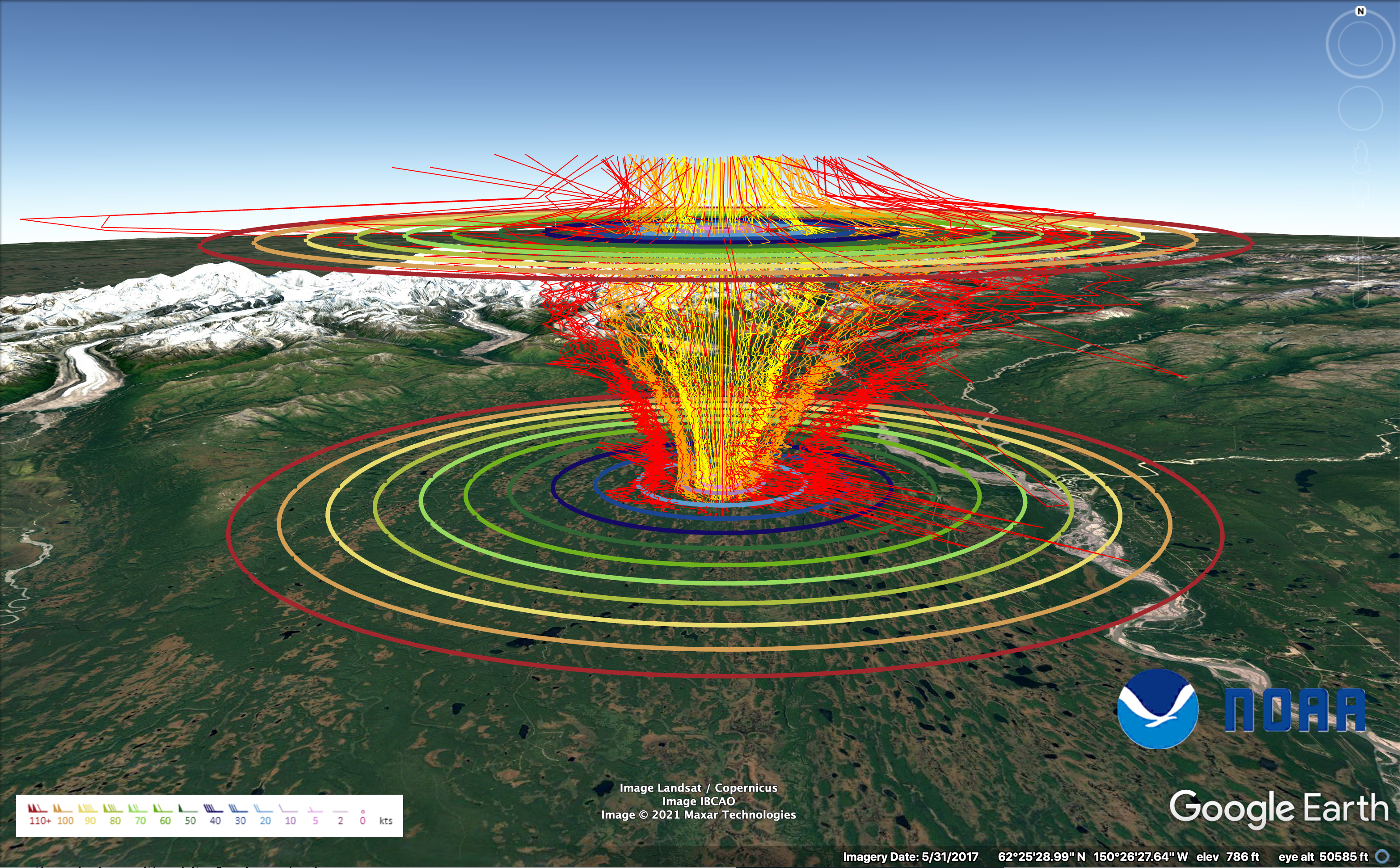
3D Wind Rose Diagram from a full year of weather data that came from a phased array radar wind profiler in Alaska. An example of phased-array radar data modeling of temporal wind vectors. Research conducted at NOAA Radar Operations Center in Norman Oklahoma. Interactive 3D model and visualization by Reuben Reyes. (Year 2022)

Visualization of radar rainfall estimates across the entire state of Oklahoma was conducted using a comparative analysis of one-year time intervals from 1995 to 2018. The data utilized in this visualization was obtained from the National Oceanic and Atmospheric Administration (NOAA) and was used to show drought years versus flood years in the state of Oklahoma. An example of 4D spatio-temporal data visualization. Research, programming, and 4D model by Reuben Reyes while working at the National Weather Center (Year 2019)
Virtual Earth Visualization

Virtual Earth above surface visualization representation of earthquakes along a section of South America Pacific coast with indicators of subduction zone from color gradient from epicenters. Research by Dr. Jad R. Ziolkowska and Reuben Reyes (Year 2016)